Custom Tin Printing Guide: Artwork, Color Matching and Registration
Learn how artwork, printable areas, color references, tin structure and finish affect custom tin printing—and what to prepare before requesting a quotation.
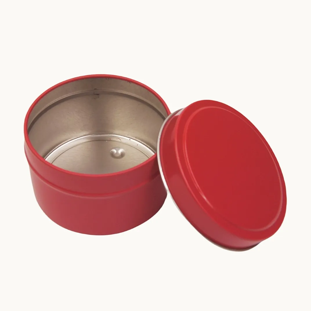
A tin can look correct in a screen mock-up and still need changes when the artwork is fitted to the real package. The lid, body panels, seams, rounded corners and selected finish all affect how a design is positioned and how its colors are viewed. Planning these details before printing helps a buyer and supplier review the same expectations.
Begin with the tin structure and printable area
Confirm the tin style, lid construction and intended printed surfaces before preparing final artwork. A flat layout or dieline should show how each panel maps onto the finished tin. Ask the supplier for the current template for the selected structure, and confirm which areas are printable, folded, joined or otherwise unavailable.
Keep important text, logos and fine details clear of seams, rolled edges and panel transitions. The exact safe area depends on the tin design and production method, so use the approved template rather than applying a generic measurement. If the structure or dimensions change, have the artwork checked against the revised layout.
Prepare files for review
Send the editable artwork file when available, along with any linked images and fonts or converted text. Include a clear reference showing the intended front, back, sides, lid and base. Mark the logo position, orientation and any areas that should remain unprinted.
If you are still developing the design, a high-quality visual mock-up can help communicate the direction, but it should be identified as a reference rather than production-ready artwork. The supplier can then confirm the required file format, template and print setup for the specific tin.
Set color expectations early
Record brand color references and identify any priority colors. A screen preview is useful for layout, but it does not by itself confirm how a color will appear on a metal surface. The substrate, ink system, underlying surface treatment and finish can affect the viewed result.
Ask whether the design needs an opaque white layer beneath selected colors, or whether any areas should show the metal surface. These choices depend on the artwork and print method. If a Pantone reference or other color standard is important, share it with the files and agree how the color will be reviewed before production.
Review registration and special details
Registration describes how separate printed elements align. Small misalignment can be more noticeable where a design crosses panels, meets a seam or combines with a second printed area. Point out the details that matter most, such as a border that must continue around the body, a logo centered on the lid or artwork that meets at an edge.
Embossing, debossing, metallic effects, spot finishes and other special treatments may need separate artwork layers or clear callouts. Confirm that the effect is available for the chosen structure and identify its position on the layout. Do not rely on a flattened image alone to explain a special finish.
Check the proof and sample against the brief
Review the proof for orientation, text, spelling, panel placement, color references and the position of special effects. Ask for corrections before approving it. A proof can help confirm layout, while a physical sample may be needed to assess the appearance on the selected material and finish. Agree with the supplier which review stage is appropriate for the project.
Keep the approved artwork version and review notes together. If the artwork, structure, material or finish changes later, confirm whether the previous approval still applies.
Artwork checklist for a quotation
- Tin style, approximate dimensions and intended contents or packing method
- Artwork file or visual reference, with the requested print surfaces identified
- Brand color references and any priority colors
- Logo position, text orientation and areas intended to show bare metal
- Requested embossing, debossing or other special effects, marked by location
- Target quantity and number of artwork versions or designs
These details help the supplier review the layout, identify questions and explain what is needed before printing. They do not replace confirmation of the final structure, production artwork or color review method.
Plan the print review before mass production
Custom tin printing is a coordination step between the packaging structure and the brand artwork. Start with the correct tin layout, make color and finish expectations explicit, and review the proof against a written brief. For a project review, send the tin dimensions or reference, artwork, target quantity and any special print requirements.